CTA (Call to Action) is one of the most popular terms in marketing. This is the name given to all elements that call for a target action, such as buying a product, ordering a service, or subscribing to an email newsletter. Most often, CTA is an order button or a website registration button.
Different types of buttons collect user data for lead generation. For example, when downloading promotional materials and lead magnets, you need to enter contacts in the form. When making a purchase, the client usually leaves an email or phone number so that they can be contacted for delivery. The company also receives contacts when the user requests a consultation or preliminary calculation. Each call to action performs its function, but ultimately leads to receiving a lead.
What types of appeals are there: popular examples
| subscribe | read more |
| subscribe to the newsletter | read other articles |
| register | download |
| try | get a consultation |
| find out more | add to cart |
| join | buy |
| support | buy now |
| share (on social media) | book |
| begin | place an order |
| contact | order delivery |
| order a call | choose |
| leave a call | confirm |
The importance of Call-to-Action (CTA) is explained by psychology. When viewing advertising material, the user already expects to see a call to action. This does not mean that he is ready to make a purchase, but his experience suggests that there should be a CTA button somewhere on the page. The mind is tuned to perceive such an offer, so calls are perceived naturally.
Clicking on the button brings a “reward” – access to information, a bonus or an offer. With repeated repetition, a conditioned reflex is formed: clicking on the CTA is associated with receiving a reward. In addition, such buttons stimulate curiosity. The user knows roughly what to expect, but the intrigue – what exactly is hidden behind the button – motivates him to act.
How to create an effective CTA
Correctly determine the stage of the sales funnel and product features. For a landing page for an expensive car or a country house, it is strange to indicate the CTA “Buy”, because such purchases do not happen quickly and spontaneously. It is logical to offer a consultation or a catalog first.

Think through call-to-action options. When there are several versions of a product, different CTAs are a good solution.
For example: YouTube Premium offers users different subscription options, from free basic access to a premium plan. The free option includes watching videos with ads and limited functionality, so the action button here is “Start watching for free.” However, for users who want advanced features, such as ad-free viewing, the ability to download videos, and access to exclusive content, the CTA changes to “Try Premium.”
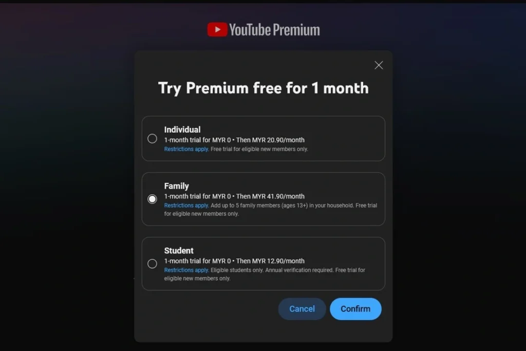
For those choosing an individual or family plan, which requires additional clarification of details, the call to action can be replaced with “Learn more” or “Choose a plan” to help the user understand the benefits of each option and make an informed choice.
Make the call to action clear and use a verb. The user should understand what will happen when they click the button: purchase, submit an application, subscribe, etc.
How to improve the effectiveness of CTA
Make the CTA noticeable. A simple link in the text may get lost. A button that is too small and dim will also not bring results. Do not skimp on good design and test options: shapes, colors, sizes, fonts, locations. A/B tests or multivariate testing are usually used.
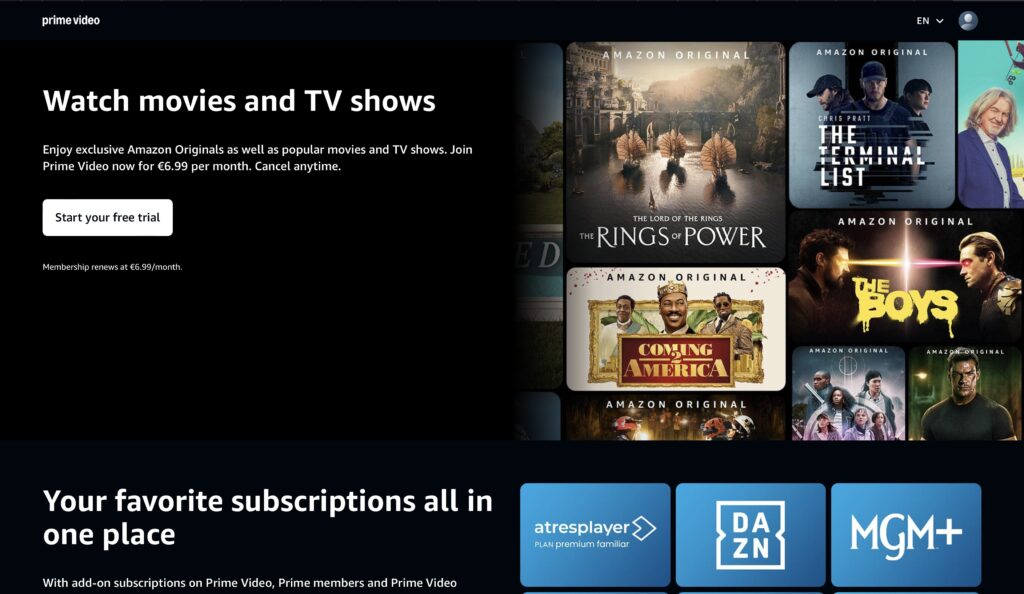
Add scarcity and/or benefit. Indicate that the offer is limited, show the discount amount, free period.

Explain the CTA. Briefly tell the user what awaits them next, show simplicity and speed.
Example. The “Registration” button can be a turn-off. Experience tells us that there are several fields to fill in, long confirmations by email or SMS. If you immediately indicate that registration is quick, a person is more likely to click on the link.

First-person CTA. A technique that adds personalization. For example, replace “Buy” with “I want to buy.” A personalized CTA converts 42% more users than a neutral call to action.
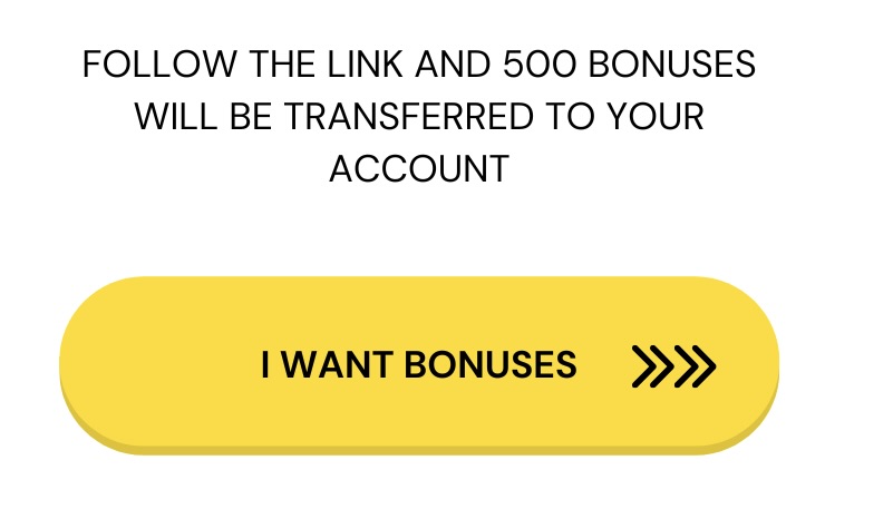
Repeat buttons. When the landing page is long and there is a lot of information, it is worth duplicating calls. Also add different CTA options: primary and secondary. The “Buy” button is suitable for hot customers who are ready to buy. This call is usually the main one. For users who doubt, a CTA offering a consultation or advertising materials is suitable.

Proper marketing content always includes a Call-To-Action that moves a potential client along the sales funnel. But according to statistics, 70% of small B2B business websites do not have calls to action. This is a mistake, because even a selling description of your product will not lead the user to a purchase. CTA simplifies the client’s path to conversion and explains what to do next.
Leave a Reply