Pre-Landing is an intermediate page between an advertisement and an offer landing page, which warms up the audience’s interest and increases conversion.
Why do you need a pre-landing page?
A pre-landing page performs several key tasks:
- Audience filtering. Filtering out random users who are not ready for conversion.
- Warming up and engaging. Preparing a potential client to make a decision through useful content.
- Bypassing moderation. Hiding aggressive advertising or controversial content from advertising platform moderators.
- Increasing trust. Demonstrating reviews, expertise or real stories that create a positive perception of the offer.
Examples of pre-landers for top verticals in affiliate marketing
In this section, we will show examples of pre-landers for various verticals in affiliate marketing. Keep in mind that some approaches will work better when pouring into offers from one vertical than others.
We will show examples of pre-landers for the following 10 verticals:
- E-Commerce;
- Gambling;
- Utilities.
- Nutra;
- Dating;
1. E-Commerce
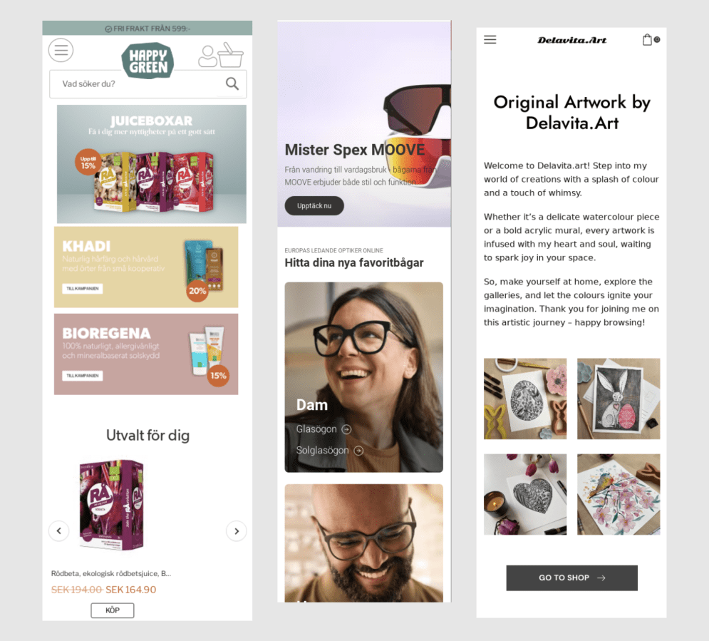
In the e-commerce vertical, the goal of a pre-landing page is to engage users with personalized recommendations, discounts, and high-quality visuals that highlight specific products or collections. These pages aim to create a smooth transition between the ad and the main shop, ensuring users feel motivated to explore the product offerings or make a purchase.
Key moments:
- Visually Clean Design: All three examples from the image share a clean, minimalist design. This ensures that users are not overwhelmed by too much information, allowing them to focus on the product or offer being promoted. The use of white space and high-quality product images draws attention to the items themselves.
- Personalized Offers and Discounts: By offering specific discounts, such as 15%-20% off, these pre-landers make the user feel like they are getting a special deal. The inclusion of product recommendations also adds a personal touch, encouraging users to explore further.
- Content and Storytelling: For brands or products that benefit from a more narrative-driven approach (like artisan goods), a content-rich pre-lander works wonders. By explaining the backstory or craftsmanship behind the products, you create a more emotional connection with the user, increasing the likelihood of conversion.
2. Gambling
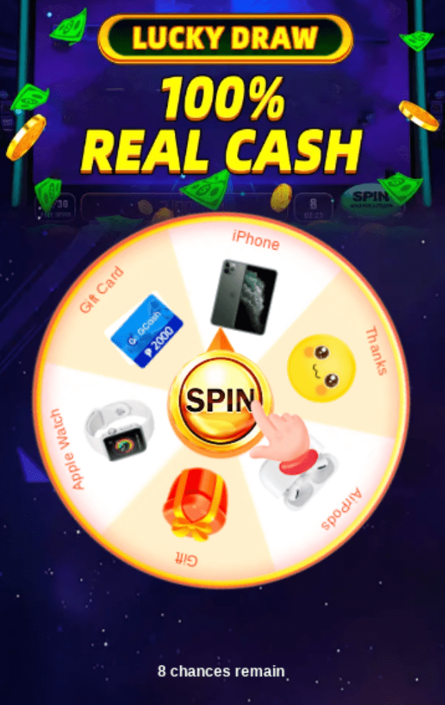
These pre-landers encourage users to “win” by spinning a wheel for enticing rewards like cash prizes, electronic gadgets (e.g., iPhones, Apple Watches), or gift cards. The element of chance makes the offer feel exclusive, boosting engagement. The first image above, showing a “Spin the Wheel” creative, perfectly exemplifies this strategy. Users feel a sense of achievement even before they’ve signed up, which enhances their likelihood of completing registration or making a deposit.
Key moments:
- Clear and Immediate Bonus Information: The “up to 500 KR” bonus offer is prominently displayed, making it the focal point of the page. Users are more likely to engage when they know there’s a significant reward waiting for them after registration.
3. Utilities
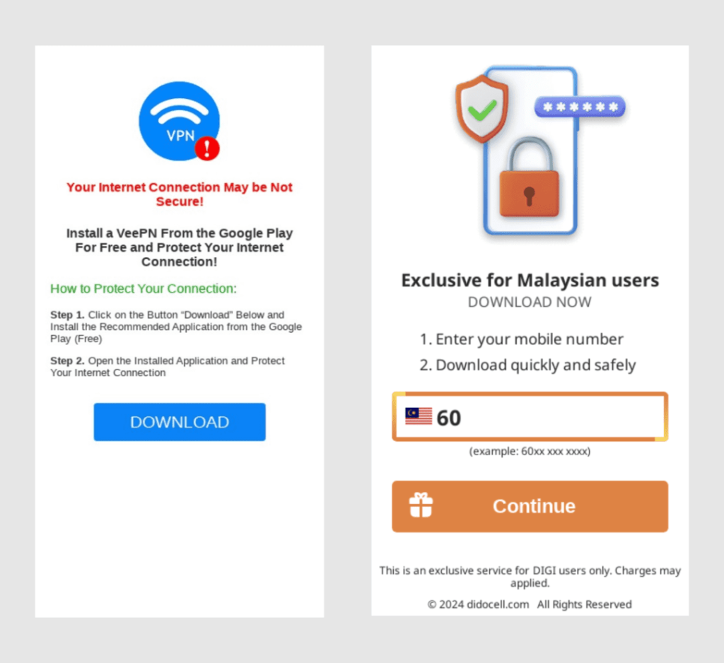
In the Utilities and Antivirus vertical, pre-landing pages are designed to highlight security concerns and provide immediate solutions to users. The goal is to make the user feel vulnerable without protection and then offer an easy fix, often in the form of a free download or a quick sign-up. The pre-landers focus on building urgency, often using language like “your internet connection may not be secure,” as shown in the examples.
Key moments:
- Urgency and Fear-based Messaging: Both examples use urgency-driven language like “Your Internet Connection May Be Not Secure!” and “Exclusive for Malaysian users.” This taps into the user’s fears of being unprotected or missing out on a unique offer. The messaging creates a strong emotional drive, pushing users to take immediate action.
- Simple and Clear CTA: The call-to-action buttons are prominent and direct, with options like “Download” or “Continue.” The simplicity in the CTAs encourages users to act quickly without overloading them with too much information.
- Step-by-step Instructions: The pre-landing pages provide clear, step-by-step instructions for users to follow. Whether it’s downloading an app or entering their phone number, the process is laid out to make it as easy and frictionless as possible, reducing any hesitations that users might have.
4. Nutra
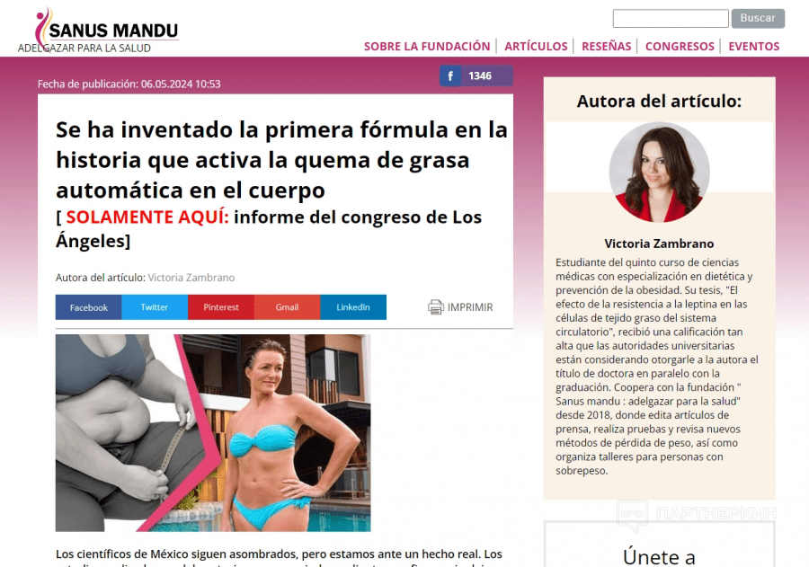
In the Nutra vertical (health and wellness products), the main objective of a pre-landing page is to build credibility and trust in the product being promoted. Often, Nutra pre-landers rely on scientific claims, testimonials, and before/after results to convince users that the product is both safe and effective. The goal is to lead users toward making an informed decision by showcasing real-life results and highlighting the product’s unique benefits.
Key moments:
- Compelling Visuals and Proof: The most impactful Nutra pre-landers always feature strong before/after images that visually demonstrate the product’s effectiveness. In this case, the weight loss transformation grabs the user’s attention immediately and adds credibility to the product claims.
- Scientific and Medical Validation: Featuring expert opinions or scientific studies, as shown with the inclusion of the author’s academic background, strengthens the page’s message. This authority is crucial in the health and wellness sector, where trust is a key driver for conversions.
- Urgency and Exclusivity: Using language that implies urgency and exclusivity, such as “Only here” or referencing exclusive reports, gives users the feeling they are accessing something rare or time-sensitive, encouraging them to act quickly.
5. Dating
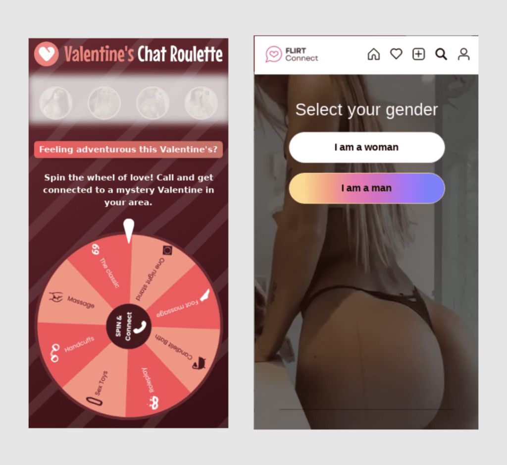
In the dating niche, pre-landers serve two main functions: to build curiosity and filter users by their preferences, whether by gender, location, or interests. By leveraging provocative visuals and interactive elements, these pages work to entice users and push them toward registering or engaging with the dating service.
Key moments:
- Interactive Gamification: Gamified elements like “Spin the Wheel” provide an added layer of engagement. The playful and adventurous nature of the options offered on the wheel encourages users to interact with the pre-lander, while also subtly promoting the dating service as something exciting and unexpected.
- Provocative Visuals: Both creatives use bold, provocative visuals to capture user attention immediately. In the second example, the background features a suggestive image that leaves little to the imagination, reinforcing the type of service the user is engaging with. This visual strategy ensures that users know exactly what to expect from the platform.
- Personalization and Filtering: The gender selection option not only helps filter the traffic but also adds a layer of personalization. By selecting their gender, users feel like the platform is tailoring the experience specifically for them, which increases the likelihood of engagement.
Now you know what pre-landing is, what it is responsible for in the flow, and how to make pre-landing attractive to the user. The examples from the article will be enough to focus on working approaches when creating your pre-landing. It is worth noting that you can experiment, since different promotion methods are appropriate for different products.
Leave a Reply